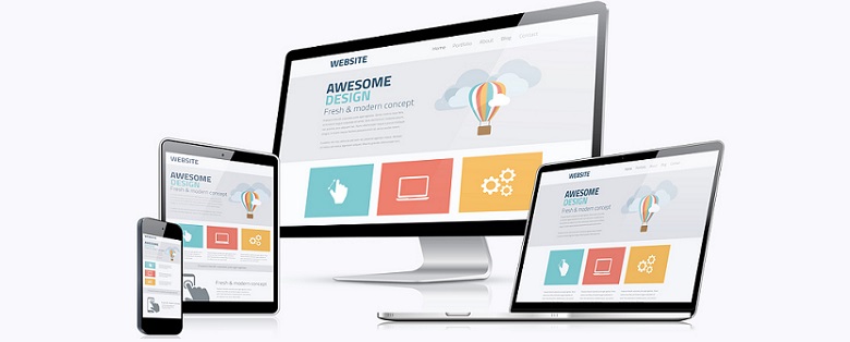
Responsive design has become a somewhat recent catchphrase, describing websites constructed for more efficient use on mobile devices. It delivers content based on the size of the accessing device's screen, ensuring that users have a positive experience whether on laptop or smartphone.
It is important that web designers understand that responsive is just a general term under which three types of functional site structures are described. To provide high levels of user-friendly function, web design services must understand responsive, adaptive, and fluid design, and what each of those terms means in relation to each other.
Responsive Design
More than just a simple way to categorize a website that is adjustable to different screen sizes, responsive design works using specific break points assigned to different website elements. In other words, all text, images, media, and the whole layout itself behave according to instructions set into the code that tells these elements how to behave depending on the accessing device.
The advantage of this structure is that web designers can include multiple break points within the same code, making coding for all possibilities much easier. On the not so positive side, it involves a much lengthier planning process by web design services to determine all those break points. Responsive sites can also take longer to load, as the loading device is first determined and then all the elements are configured to display according to the set break points for that device.
Fluid Design
Fluid design is as adaptable as responsive layouts; however, it achieves its adaptations in a completely different way. Where responsive sites are adjusted by dictating specific element behaviors like size and positioning based on different devices, fluid sites work by assigning percentages to the different elements. For example, by assigning a percentage of 50% to the size of an image, that image would always present at 50% of the page size regardless of which device it appears on.
A fluid layout is the most adaptable option that web designers can use, involving only one set of code that instructs elements on how to appear on different devices. Despite all that fluidity, this method may not be suitable in all instances due to the effects of stretching and crowding, which can distort images.
Adaptive Design
Different than both other methods, adaptive design is yet one more technique that web design services can use to create a responsive website. Unlike fluid and responsive sites that adjust according to instructions within the code, adaptive sites simply determine the device the site is being accessed from, then serve content from a page laid out specifically for that device.
The main advantage to this approach is that pages load much faster and every page should look exactly as was intended. The disadvantage is that adaptive sites require more effort from web designers and greater resources. Designers must create multiple versions of the same site for each viewing device, which can increase expense considerably.
So which method is better for web design services to use when building functional, user-friendly, and adjustable websites? That depends on the user and what device will be used to access a site. It also depends on the available budget as well as what elements and qualities are most important for each individual site. In building an effective and responsive website, web designers must consider all of these things, then decide whether an adaptive, a fluid, or a basic responsive design will be most functional overall!


