Typography is more to web designing than just a pretty typeface. When used effectively, typography is a critical element that allows web designers to create mood and presence and get their message across more easily. Use the helpful typography tips from web designing services below so type is most effective and easily read by users to get the full message.
1. Less Is More
Limit the number of typefaces used in web designing to three or less per site. When properly used, fonts can indicate importance, order, and a variety of functions. Using too many fonts can be confusing or fail to generate the association necessary for good function. Instead of adding more font families, use the same ones in different variations like plain, bold, and italic.
2. Use System Fonts
Even though web designers have the ability to embed fonts into their code using TypeKit and Google Web Fonts, these services do not guarantee that fonts will appear as normal on every site. Avoid the possibility of fonts not displaying properly by sticking with standard options as much as possible. An added benefit when using commonly known system fonts is that visitors are used to seeing them and can more easily read them.
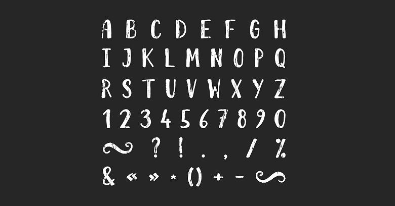
3. Choose Distinguishable Fonts
Some fonts have letters that are hard to distinguish from other similar letters, making reading more challenging and worsens the smaller the type. Web designing services recommend avoiding clarity issues by using a typeface where all letters are easy to distinguish and readable even when reduced for finer text. Choose an easy-to-read typeface that looks great at multiple sizes.
4. Use Contrast and Color Effectively
Contrast is important to promote readability. Even when using a more subtle shade, type should still stand out enough from the text background that it is easy to read without parts of the letters disappearing. The smaller the type, the greater the contrast should be to ensure easier reading. In addition, do not use red or green type in web designing since these are the most common forms of color blindness.
5. Avoid Reducing the Leading
Leading is the space between lines of type. Fonts are designed to produce a standard amount of leading so they can be read more easily. Increasing leading slightly can improve readability even more by increasing the whitespace between lines, but decreasing leading does the opposite. Web designers warn against reducing the white space, suggesting either leaving it natural or increasing it. Never tighten just to get text to fit a certain space.
6. Avoid All Caps
Using all capitalized letters is another practice that greatly reduces the readability of text and slows down readers. While all caps may be necessary for acronyms and other specific initials, web designing services should never use it for copy text that must actually be read.
7. Do Not Use Blinking Text
Text that blinks or flashes is not only distracting and annoying, it can actually trigger seizures in some people. Find other, more effective and user-friendly ways to highlight and emphasize text.
To create a great website, designers are challenged to use the basic elements of web designing and turn them into something functional and unique. As tempting as it may be to use fancy fonts and manipulate text, web design services caution against doing this.
Instead, web designers should experiment within the boundaries of basic typography and use other design elements such as color, size, whitespace, and imagery in order to get the most from their chosen typefaces. In doing so, the results will be a website that is both easy to read and functional as well as attractive to the eye!


